I build websites using a "mobile first" responsive design strategy. Using an agile approach, I take pride in creating websites that have an ease of use, a modern feel, and reliable functionality. You'll find a few examples of some of the websites I've created over time during my professional career. Some websites were built from the ground up and others were updated and maintained (depending on the customized frameworks or UX/UI requirements). If you have any questions or specific inquires, feel free to email me via my contact page.
Click image to enlarge
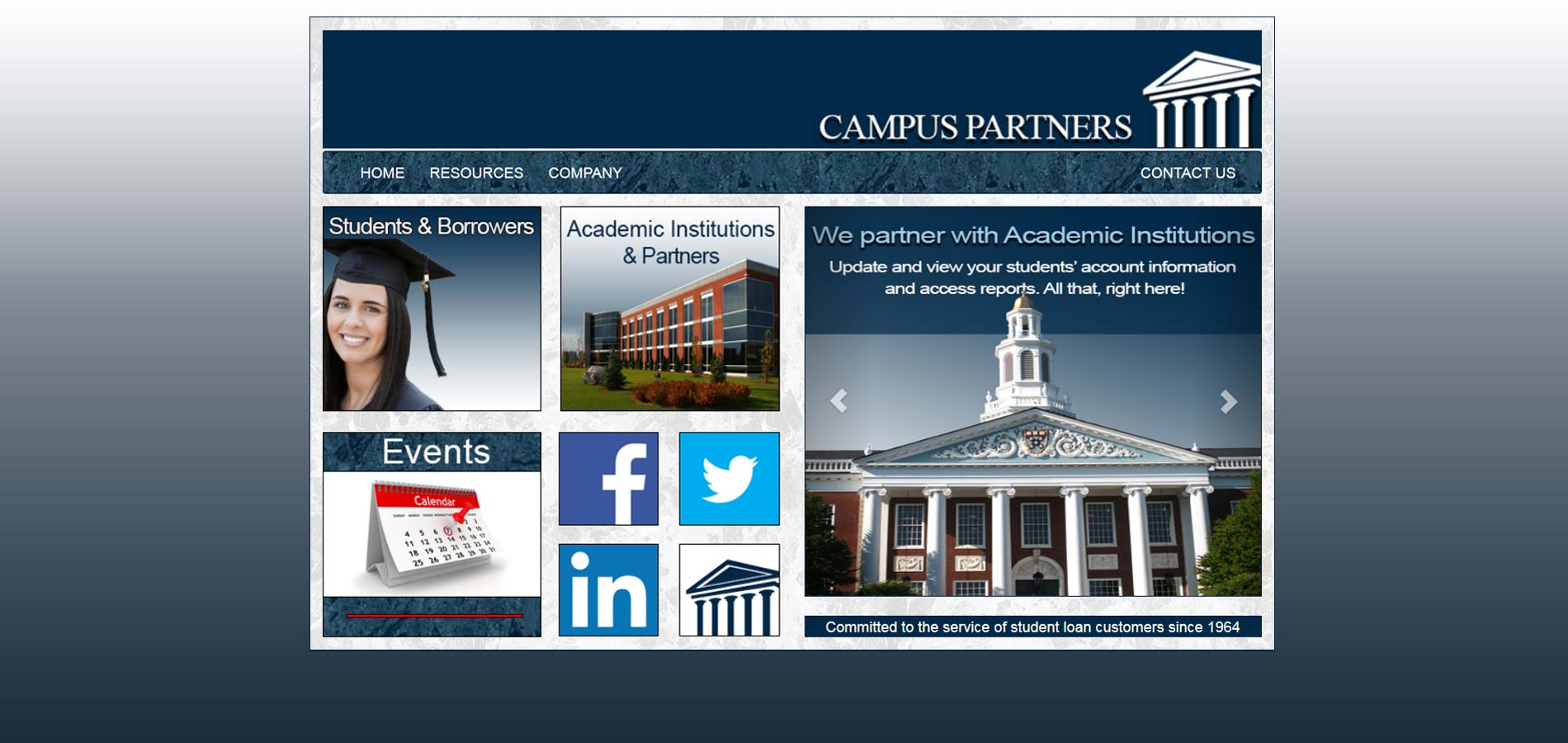
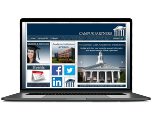
Project: This is the homepage revision of the corporate Campus Partners website. The company hosted three websites for their student users. This website served as the main administration website for users/students. It's purpose was to provide information about the company itself, any important events in relation to student loans, any student loan resources, and various ways to contact customer services representatives.
Click here to see my website design method
Status: Website active from 2014-2015. Campus Partners was purchased by Nelnet in 2015. URL is no longer active. (url: www.campuspartners.com)
Click image to enlarge
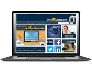
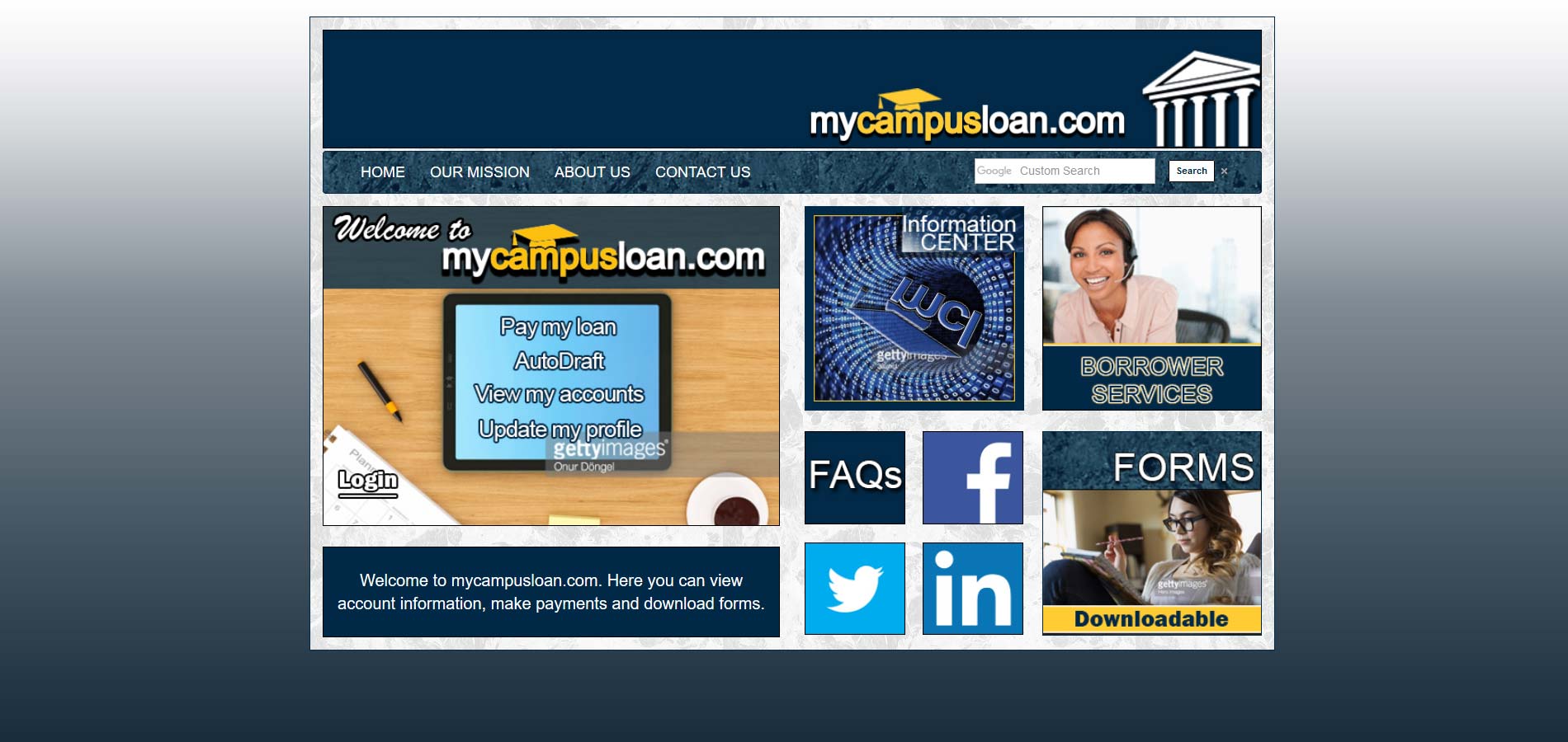
Project: This is the homepage and login page revision of the Campus Partners MyCampusLoan website. The company hosted three websites for their student users. This website served as the login for users/students to pay, maintain, and keep up with the status of their student loans. It's purpose was to give parents and students access to their student loan management tools and resources. Once the user has logged in, access is granted to all user past and current loan records (along with account modification abilities).
Click here to see my website design method
Status: Website active from 2014-2015. Campus Partners was purchased by Nelnet. URL is no longer active.
(url: www.mycampusloan.com)
Click here to see the original java mycampusloan application website image.
Click here to see the working revision website.
Click image to enlarge
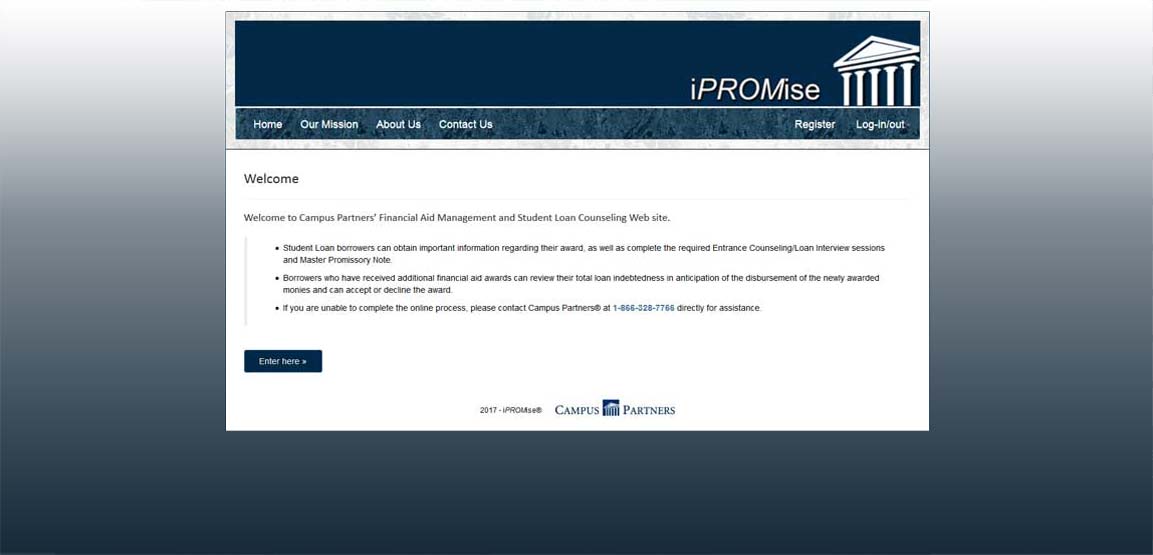
Project: This is the homepage and login page revision of the Campus Partners iPROMise website. The company hosted three websites for their student users. This website served as the main registration login for users/students. It's purpose was to give parents and students access to the student loan promissory note. Once the contract was accepted by the user and relavent user information stored in the company's database, the users would have access to mycampusloan.com.
Click here to see my website design method
Status: Website active from 2014-2015. Campus Partners was purchased by Nelnet.
URL is no longer active. (url: www.ipromise.com)
Click image to enlarge
Project:The main task of this website was to maintain and update the current products (and feaured products) of the Calphalon website. I was sent content to update existing products using spreadsheets and internal communications sent by Newell Brands. The main task I was responsible for included: content management, construction of promotional banners, ads, and "Espot" displays for new products and product lines targeted to our domestic market, coding custom page layout designs for new production line lauches in conjuction with nation wide campaigns, Aand adjust layouts by writing responsive code that allows for a fluid design layouts to insure the best dynamic experience for ease of customer use.
Click image to enlarge
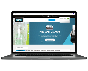
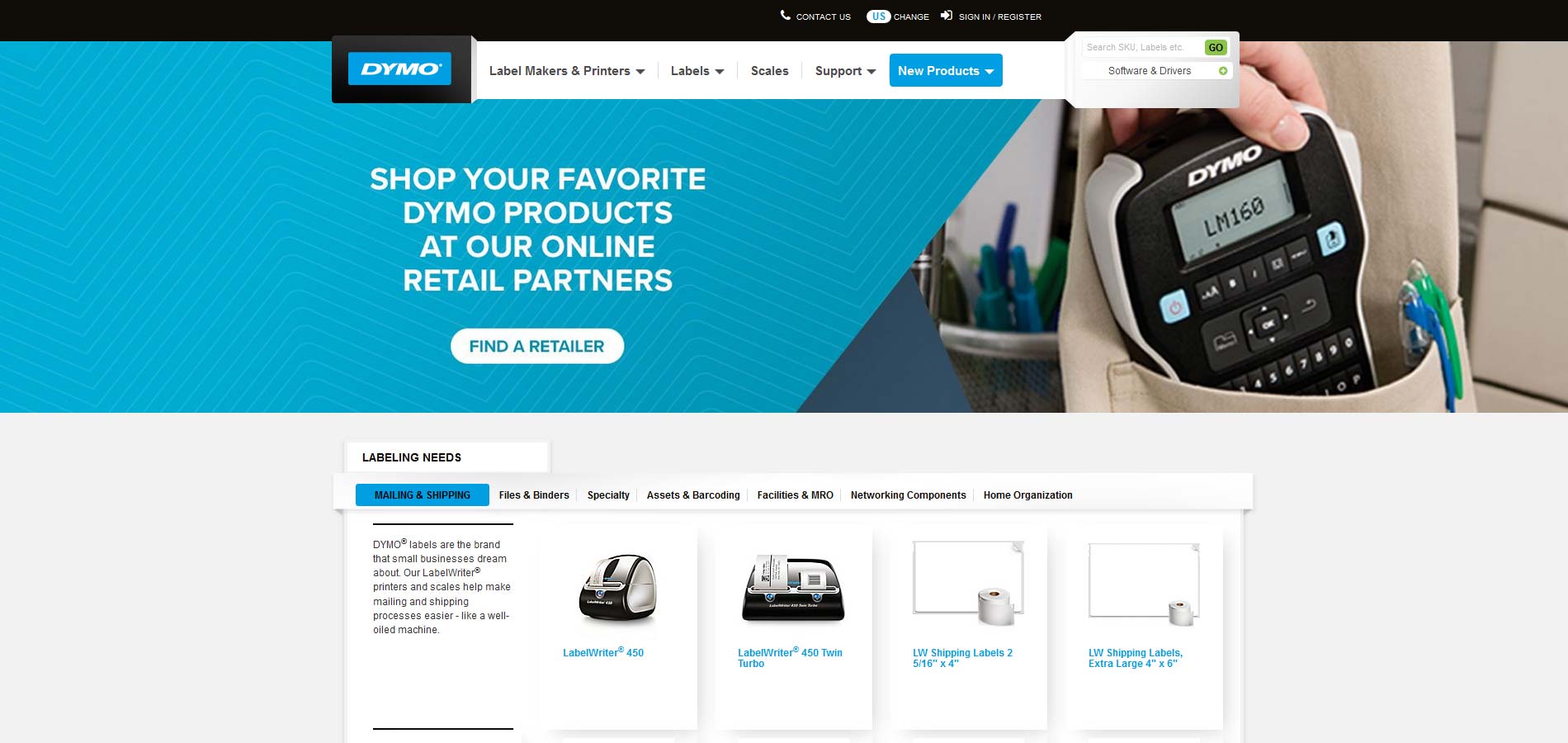
Project:The main task of this project was to maintain and update the current products (and feaured products) on 8 International DYMO websites. I was sent content (from department sources in New York and London) to update existing products using spreadsheets and overseas conference meetings with Newell Brands International offices. The main task I was responsible for included: Content management for consumer products for the entire collection of North American and European DYMO websites (world wide which include the countries: United States, Belgium, France, Germany, Netherlands, Great Britian, Canada, and Australia). Construction of promotional banners, ads, and "Espot" displays for new products and product lines targeted to both domestic and foreign markets. Adjust layouts by writing responsive code that allows for fluid design layouts to insure the best dynamic experience for ease of customer use.
Click image to enlarge
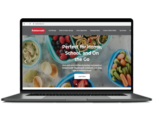
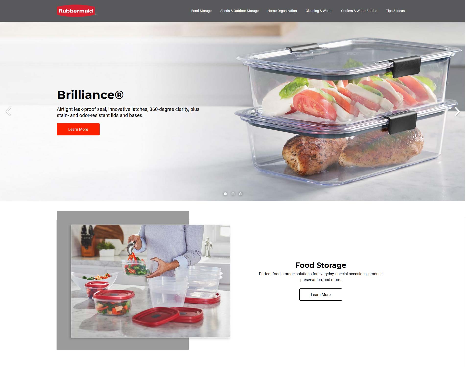
Project:The main task of this website was to maintain and update the current products (and feaured products) of the Consumer Rubbermaid website. I was sent content to update existing products using spreadsheets and internal communication sent by the company. My team was given special task along with updates, to create new landing pages for new Rubbermaid feature items. The main task I was responsible for included: content management, construction of promotional banners, ads, and "Espot" displays for new products and product lines targeted to our domestic market, coding custom page layout designs for new production line lauches in conjuction with nationwide campaigns, and adjust layouts by writing responsive code that allows fluid design layouts to insure the best dynamic experience for ease of customer use.
Status: Website is currently active (url: www.rubbermaid.com)
Click here to see the website.
Click here to see the current Rubbermaid Brilliance page.
Click image to enlarge
Project: This is the homepage and login page revision of the THORLOS Inc website. The company host one main ecommerce website for the specially made socks and [COVID19] mask the company manufactures. I built this page along with all special product feature pages. Also with the creation of feature page pages I was also responsible from all special advertisements (which included all website banners, slider images, annual sale campaigns, and popup advertisements). The website used a customized version of Symphony with a backend CMS system that I used to maintain products, description updates, and content changes.
Click here to see additional homepage lifestyle slides
Status: Website was active when I joined the company and I maintained the entire website until August 2020. Thorlo sold it's license and my role transitioned from Frontend Developer to Independent Contractor of special projects. The company is now an apparel company under the name T.H. Mills. URL is no longer active. (url: www.thorlos.com)
Click image to enlarge
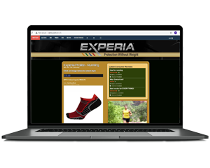
Project: Thorlos Inc. made into two brands. The first was Thorlos the original sock which targeted individuals with foot conditions and the second brand was Experia which was more of an athletic brand. The main goal of Thorlos originals was promote foot health. The main purpose for Experia was to provide comfort and increase sport performance. Both brands were sold on thorlos.com until it was decided that the brands should be represented separately, so I was given the task of creating a completely separate website to represent the Experia brand. I built a one page layout that featured all five Experia styles. With the development and launch of Experia both brands generated over a million dollars in additional revenue.
Status: Website was active 2019 until August 2020. Thorlo sold it's Experia license and my role transitioned from Frontend Developer to Independent Contractor of special projects. The company is now an apparel company under the name T.H. Mills. URL is no longer active. (url: https://www.experia-socks.com/Experia-Running-Socks)
Click image to enlarge
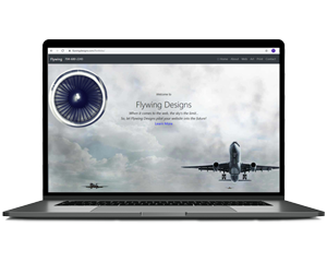
Flywing Designs is the older, smaller company version of the first portfolio website that I built in 2014. The following version displayed is the 2016 remake. Images, code, and file structure was recreated to increase website performance and optimization.